A QQ NT messenger skin for DeepSeek Harness: light and dark share one QQ NT language — clean restrained light mode (brand blue #12B7F5, light-blue bubbles) and a calm blue-gray dark mode (#101822) — applied as reversible token and layout layers that never touch your Light/Dark preference.
Install
# from npm (prebuilt)
dsh plugin --profile web add dsh-qq-skin
# from GitHub (first run asks for allowBuilds approval — follow the hint, retry)
dsh plugin --profile web add github:lispking/dsh-qq-skin
Any plugin you install runs third-party code with your own permissions — it can read your files, use your credentials, and reach the network, and tool approvals don’t sandbox it. GitHub-sourced plugins also run build scripts at install time — pnpm blocks those until you allow them, so an install can stop with ERR_PNPM_GIT_DEP_PREPARE_NOT_ALLOWED or ERR_PNPM_IGNORED_BUILDS; dsh prints the exact key to add under allowBuilds in your profile’s pnpm-workspace.yaml, and the install works on the next run. Allowing a build is a trust decision: only install sources you trust, and pin a commit (github:owner/repo#sha).
README
A QQ NT messenger skin for DeepSeek Harness (dsh). Light and dark share one QQ NT language — light mode is clean and restrained (near-white surfaces, neutral borders/hover, brand blue #12B7F5 and light-blue bubbles #A8E3FF as recognition accents), dark mode is a calm blue-gray (base #101822, desaturated, blue reserved for accents), instantly recognizable. Ships with five palette variants (Classic Blue / Vivid Purple / Clean White / Green Bubble / Deep Black), configurable toggles and sizing, plus a settings-panel visual switcher with hot reload.
How it works. The skin is two reversible layers; it never registers a new theme id and never touches the user's Light/Dark/System preference.
- Token layer — stacks one
--dsw-*semantic-token override viactx.theme.overrideTokens('dsh-qq-skin', ...). Every token carries a{ light, dark }pair, so the skin follows the active base palette instead of fighting it. Light mode runs blue through surfaces, borders, interactions, and scrollbars; the dark palette is a#101822-based calm blue-gray scale where blue only accents (brand, bubbles, primary buttons). The set is generated per palette (buildTokenOverrides(palette)): the five palettes share the neutral blue-gray skeleton and differ only in the personality tokens.- Layout layer — injects one global
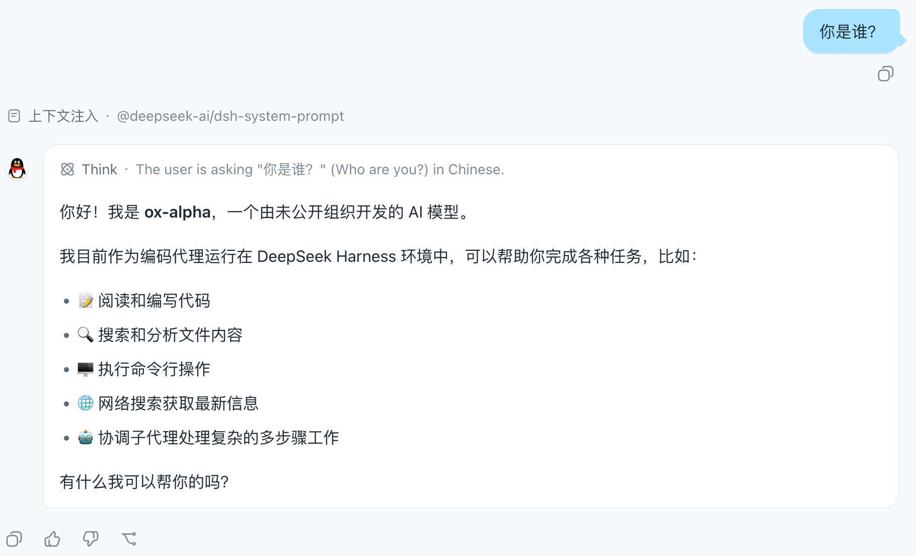
<style>tag (qq-layout.ts) for geometry and structure: the chat flow is centered and narrowed, user bubbles are light blue with a "tail", assistant rows get an avatar disc + white card (matched viadata-chat-flow-kind='assistant-step'), the input area becomes a capsule, plus a slim conversation-header divider, QQ-styled timestamps and scrollbar, and sidebar session-row hover/selected states. The brand area stays product-native — the QQ feel comes entirely from the blue token layer. Colors always come from--dsw-*tokens, and dark variants are gated bybody[data-ds-dark-theme]. The CSS is generated from the config (buildQQLayoutCss).On unload both layers are fully removed through effect cleanup and the product look returns. Settings and config changes hot-reapply both layers via
QQSkinRuntime.updatewithout restarting the plugin.
Screenshots
The chat view in the Classic Blue palette: centered, narrowed chat flow, light-blue user bubbles with a "tail", and the penguin avatar disc on assistant rows:
The QQ Skin settings row in the App settings General section, with the palette / bubble tail / assistant avatar / chat width toggles:
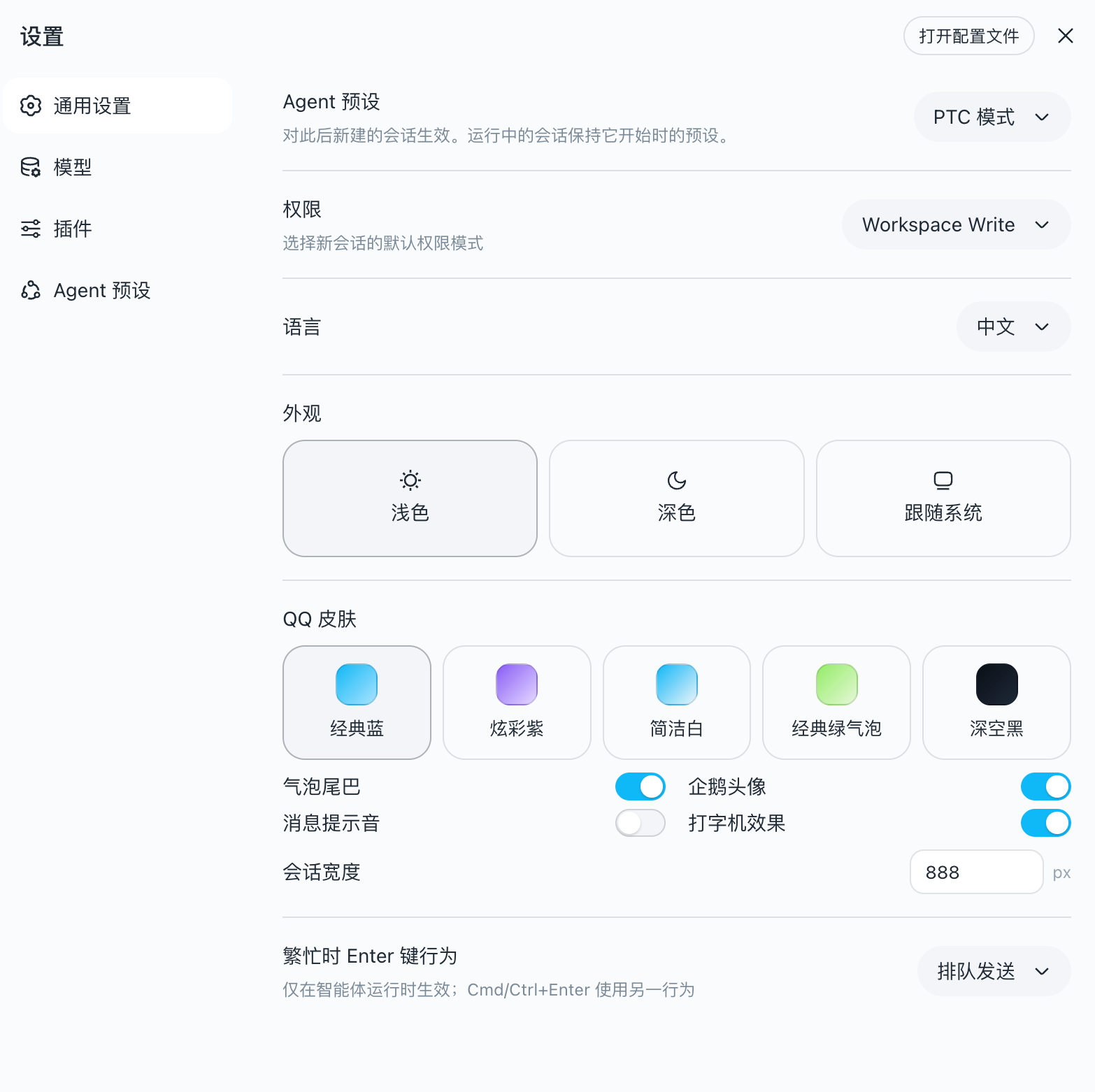
Settings panel
The skin registers a QQ Skin settings row in the App settings General section, with visual toggles for palette / bubble tail / assistant avatar / chat width. Changes apply immediately (hot reload remounts both layers) and are persisted to the user-settings document. The settings panel overrides the static config below.
Configuration
The plugin receives config the cordis function-plugin way (apply(ctx, config)); unset fields fall back to defaults:
| Option | Default | Meaning |
|---|---|---|
palette |
'classic' |
Palette variant: classic Classic Blue / vivid Vivid Purple / clean Clean White / green Green Bubble / black Deep Black |
bubbleTail |
true |
Small triangular "tail" on the right of user bubbles |
assistantAvatar |
true |
Official QQ-penguin avatar disc left of assistant messages |
chatMaxWidth |
880 |
Max width of the chat flow (px) |
Example (set in the profile's plugin config):
{ "palette": "vivid", "bubbleTail": false, "chatMaxWidth": 720 }
What it covers
| Area | Mechanism |
|---|---|
| Brand & primary actions (QQ blue) | --dsw-alias-brand-primary, --dsw-alias-button-primary-*, --dsw-alias-state-business-* |
| Canvas & surfaces (clean light) | --dsw-alias-bg-base (#F7F9FB), --dsw-alias-bg-layer-1..3, --dsw-alias-bg-overlay |
Conversation bubbles (light blue #A8E3FF) |
--dsw-specific-bubble, --dsw-specific-bubble-highlight + layout-layer radius/shadow |
| Assistant messages | layout-layer avatar disc (token colors) + white card with border (--dsw-alias-bg-layer-1 + border-l1) |
| Chat flow | layout-layer centering (via data-chat-flow, width configurable) |
| Input bar | layout-layer capsule (data-composer-card) + toolbar button radius + --dsw-specific-input-major |
| Conversation header | layout-layer slim divider (header[class$='_header'], never hits side panels) |
| Message timestamps | layout-layer QQ-style chips (data-time-hover-root + _timeStart/_timeEnd) |
| Sidebar session rows | layout-layer hover/selected fill + status-dot radius (_sessionRow/_projectRow/_dot) |
| Scrollbar | layout-layer widening + radius (data-conversation-scroll) + --dsw-alias-scrollbar-* |
| Sidebar (clean light / blue-gray dark) | --dsw-specific-sidebar-fill (#F2F5F8), --dsw-specific-sidebar-nav-item-* + layout-layer divider |
| Text & borders | --dsw-alias-label-*, --dsw-alias-border-l1..l4 (blue-tinted strokes) |
| Status colors (QQ green/red/amber) | --dsw-alias-state-success/error/warn-* |
| Static palette (component-direct, unified sky blue) | --dsw-static-deepseek-*, --dsw-static-blue-* (remapped to the #12B7F5 sky-blue scale) |
| Markdown, scrollbar (QQ blue), menus, tooltips | --dsw-alias-markdown-*, --dsw-alias-scrollbar-*, --dsw-specific-menu, --dsw-alias-tooltip-bg |
Tokens that are not overridden keep the product default, so a QQ-skin run stays readable and consistent everywhere else.
Requirements (dsh version)
Built and run against deepseek-harness (dsh) 0.1.2-alpha.5 or later. That line removed the client @deepseek-ai/dsh-client-runtime package (client "Runtime" split refactor, 2026-08): the store engine now comes from @deepseek-ai/dsh-client-store, the client context is cordis Context plus the /client type merges of the UI packages, and host-side settings registration takes the namespace string straight in ctx.settings.register. Earlier dsh versions are not compatible — the dependency no longer exists and pnpm i fails with ERR_PNPM_WORKSPACE_PKG_NOT_FOUND.
Install
One command installs the plugin into the web profile:
dsh plugin --profile web add dsh-qq-skin
That is the whole flow: dsh plugin initializes the profile on first use,
runs pnpm add dsh-qq-skin inside the profile directory, then reconciles the
profile's bundle layer against the installed state — because dsh-qq-skin
declares dsh.bundle.patch (→ cordis.patch.yml), it joins the bundle stack
automatically. The next dsh web boot composes it, the client bundle loads,
and the skin stacks as soon as ui-theme is active.
Installing from a local checkout (path specs are anchored to your invoking
directory; link: keeps the live checkout linked):
dsh plugin --profile web add ../dsh-qq-skin
dsh plugin --profile web add link:../dsh-qq-skin
Removing is equally one command:
dsh plugin --profile web remove dsh-qq-skin
The plugin declares dsh.client with platform: web and injects the theme
and settings-collaboration services, so the Web boot loads its client bundle
and applies the layer as soon as ui-theme is active.
Development
pnpm install
pnpm run typecheck   # tsc --noEmit
pnpm test            # vitest (token shape + layout injection + runtime hot reload + settings wiring)
pnpm run build       # tsc + tsdown → lib/index.js (host) + lib/client.js (browser closure-factory)
The client bundle is produced by the same two-face layout as the harness
clientBundle preset: lib/index.js is the plain ESM host row, lib/client.js
is the window.__ModuleLoader__ closure-factory the Web boot consumes. No
build-time CSS pipeline is needed: the layout styles ship as an inline string
inside the client bundle (QQ_LAYOUT_CSS in qq-layout.ts) and are injected at
runtime via document.createElement('style') — the same shape as ui-theme's
installThemeStyles — then removed on effect dispose. Layout selectors rely on
the client CSS Modules [hash]_[local] naming ([class$="_localName"]
suffix matches) and the components' own data-* hooks, never on build-time
hash values.
The settings row (settings-row.tsx) uses inline token styles reading --dsw-*
directly, so it adds no CSS Modules pipeline; react and the collaboration
services stay external to the client bundle and resolve through the platform
module table.
License
MIT
Links
More in this category
Small-tailqwq/dsh-deep-whale#maid-atelier★ 2516
Whale-girl skin series for the DSH Web UI (maid-atelier).
elysia395/dsh-wallpaper-engine★ 957
Requires DeepSeek Harness 0.1.5-rc.1+ (DSH Desktop >= 2.0.7) and dsh-better-sidebar >= 0.19.0 - update both before installing or updating this plugin. Plays local Wallpaper Engine Video/Web wallpapers behind the chat, renders Scene wallpapers as extracted static frames, and adds content-rating/type filters, custom uploads and an iOS-style liquid-glass settings window.
d-dev0101/open-sea-skin★ 389
Realtime WebGPU ocean skin with quick controls for waves, daylight, glass opacity, and an automatic day cycle.
kingOfSoySauce/dsh-liang-skin★ 240
Adaptive reasoning slider skin that maps each model's available reasoning efforts onto a 0–30 visual intensity scale, with synchronized portraits, background, and interface colors.
RevolutionLA/dsh-dream-skin★ 222
One-command skin plugin: 8 original themes, translucent wallpaper with opacity/blur, per-user accent, and shareable theme-pack import/export, favorites and surprise-me — purely native on DSH's token system.
ymh0000123/dsh-theme-endfield★ 134
Arknights: Endfield industrial-editorial theme for the DSH Web UI: cream paper, ink text, zero border radius, two switchable accent palettes (signal yellow / teal-cyan), plus optional marching-squares contour background, ENDFIELD watermark and boot progress plate.
Community comments
Comments are public GitHub Discussions. Loading them connects to GitHub and Giscus; a GitHub account is required to post.