Appearance customization for the DeepSeek Harness WebUI: theme palette, wallpaper and video backgrounds, translucency and glassmorphism.
Install
# from npm (prebuilt)
dsh plugin --profile web add dsh-ui-appearance
# from GitHub (first run asks for allowBuilds approval — follow the hint, retry)
dsh plugin --profile web add github:TQSY114514/dsh-ui-appearance
Any plugin you install runs third-party code with your own permissions — it can read your files, use your credentials, and reach the network, and tool approvals don’t sandbox it. GitHub-sourced plugins also run build scripts at install time — pnpm blocks those until you allow them, so an install can stop with ERR_PNPM_GIT_DEP_PREPARE_NOT_ALLOWED or ERR_PNPM_IGNORED_BUILDS; dsh prints the exact key to add under allowBuilds in your profile’s pnpm-workspace.yaml, and the install works on the next run. Allowing a build is a trust decision: only install sources you trust, and pin a commit (github:owner/repo#sha).
README
中文 · English
The first appearance customization plugin in the DeepSeek Harness ecosystem supporting deep multi-dimensional UI parameter tuning — far beyond fixed presets, featuring fine-grained panel/input/code opacity controls, frosted glass, wallpaper/video backgrounds, and smart palette derivation; works on both WebUI and DSH Desktop.
Zero core-code changes: everything goes through the official plugin mechanism (
ctx.theme.overrideTokens()theme extension point and thesettings.general.itemslot). Uninstalling restores the stock UI completely.
Screenshots
| Settings panel | Wallpaper + glassmorphism |
|---|---|
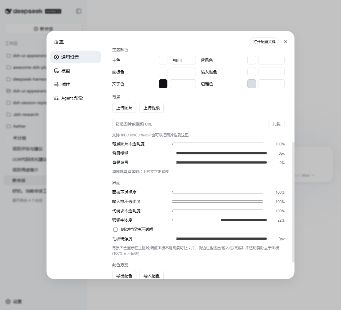 |
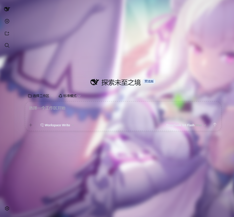 |
It also works out of the box on DSH Desktop, the desktop client — real screenshots:
| Advanced mode (native desktop layout & materials) | Compatible mode (stock upstream Web client) |
|---|---|
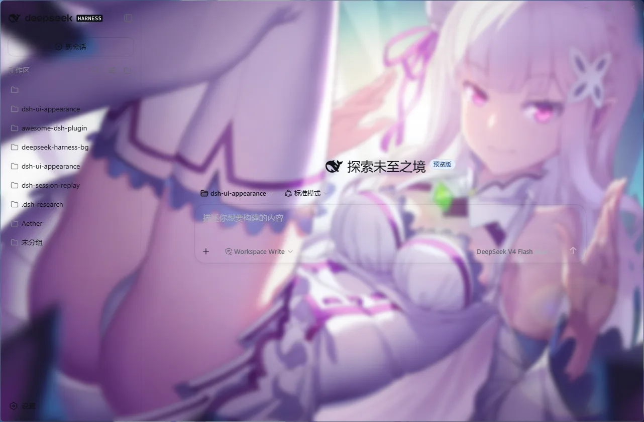 |
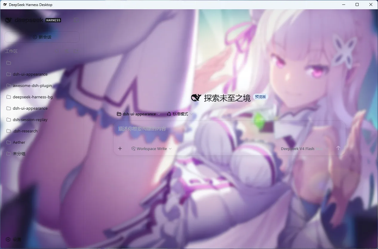 |
The wallpaper in the screenshots is © MadYY (source), shown for demonstration only — users upload their own images.

Features
Theme colors — 6 color roles: accent, background, panel, input, text, border. Each role has a color picker and HEX input; text selection and the keyboard focus ring follow the accent automatically; message bubbles follow the accent too (keeping its hue when translucent); the top-left logo wordmark ("harness") follows the accent as well.
Wallpaper background — Click to upload or drag in an image (JPG / PNG / WebP / GIF), or paste an image/video URL to load it in one click (auto-routed by extension; works with CORS-friendly hosts); the original quality is kept and stored in IndexedDB as a full-UI wallpaper (images over 4096px are scaled down proportionally, no quality drop). Brightness is sampled on upload (dark wallpapers lift the surface family) and the dominant hue is auto-derived as the accent color, so wallpaper and UI tones stay in harmony. Video backgrounds (MP4 / WebM, muted loop, mutually exclusive with images) are also supported; both images and videos live in IndexedDB, keeping localStorage quota free.
Glassmorphism & translucency — Panel opacity and glass-blur sliders let the sidebar, settings panel, chat area, task panels, cards and buttons melt into the wallpaper instead of sitting as solid blocks; the sidebar can stay opaque on its own. Input and code blocks have independent opacity knobs (100% = follow the panel opacity). Emphasized text chips (pnpm-lock.yaml, lib/) keep a low-alpha accent tint — emphasis via hue, not solid fill — with an "emphasis tint" slider (0% = fully transparent) for independent tuning.
Background ambience — Three independent sliders: background opacity (how strong the wallpaper is), background blur (pushes it into the distance), and a scrim that auto-tints with the light/dark scheme to keep text on the image readable.
Presets to start from — Default / Midnight / Ocean / Forest / Rose / Monochrome; apply one click and keep fine-tuning, never locked in.
Scheme sharing — Export your palette as JSON (copied to clipboard), paste to import; sharing a theme is one snippet of text.
Every change applies live — no refresh, no save button.
Installation
Option 1: npm one-liner (recommended)
dsh plugin --profile <name> add dsh-ui-appearance
Option 2: one-command script (Windows, no npm account and no git needed)
powershell -ExecutionPolicy Bypass -Command "Invoke-WebRequest 'https://raw.githubusercontent.com/TQSY114514/dsh-ui-appearance/main/install.ps1' -OutFile install.ps1; .\install.ps1"
The script pulls the pre-built package straight from the npm registry (the published tarball ships the built lib/), links it into the profile's own node_modules and registers it in that profile's package.json (a dependencies entry plus dsh.profile.bundles, matching what dsh plugin add produces) — idempotent, safe to re-run. Optional parameters:
.\install.ps1 -Version '0.1.7'      # pin a version (default: latest release)
.\install.ps1 -DshHome 'D:\.dsh'    # custom DSH home (default %DSH_HOME% or %USERPROFILE%\.dsh)
.\install.ps1 -ProfileName 'web'    # target profile (default web; must be initialized)
Option 3: from source (verified end to end)
git clone https://github.com/TQSY114514/dsh-ui-appearance.git
dsh plugin --profile <name> add file:<path-to-clone>
Uninstall: dsh plugin --profile <name> remove dsh-ui-appearance (for the script install, delete the junction under the profile's node_modules plus the dependencies/bundles entries it added to the profile's package.json).
Updating: after a new release, simply re-run add or the install script to upgrade to the latest version.
DSH Desktop users: Desktop keeps its own profiles, independent from the WebUI. All three methods above work — just install into the profile Desktop actually activates (named
desktopby default; inside the built-in Desktop terminal, a plaindsh pluginalready targets the active profile).
Both installation paths (npm registry and
file:source install) are verified end to end: the host half has zero@deepseek-airuntime dependencies, and both the browser and the Host load correctly. After cloning,pnpm installbuilds automatically; after code changes, re-runpnpm install && pnpm prepareand restartdsh web. Release history: CHANGELOG.md.
Usage
- Open the WebUI, go to Settings → General in the sidebar.
- Below the Appearance row, find "个性化外观" (Personalized appearance) and expand it.
- Pick a preset for a quick skin, fine-tune the 6 color roles with pickers or HEX input, upload or drag in a wallpaper/video, and drag the ambience and interface sliders.
- Done. Everything applies live — no refresh, no save.
Settings panel at a glance:
| Section | Controls |
|---|---|
| Presets | Default / Midnight / Ocean / Forest / Rose / Monochrome; free to keep tuning after applying |
| Theme colors | 6 roles × (picker + HEX): accent, background, panel, input, text, border |
| Background | Image upload/replace/remove, video upload/remove, load from URL (image/video), image opacity, background blur, scrim |
| Interface | Panel opacity, input opacity, code-block opacity, emphasis tint, keep sidebar opaque, glass blur |
| Color scheme | Export palette, import palette (JSON text) |
Persistence & reset
- Settings live in browser localStorage (key
dsh-ui-appearance.settings); they survive refresh and restart and sync across tabs. - Removing the plugin from the profile restores the stock UI: disposal reclaims every overridden token, stylesheet and background layer.
- Note: settings follow the browser — switching browsers or clearing site data loses them; wallpapers are stored at original quality in IndexedDB (localStorage only carries the record key), free from the localStorage quota, and persistent storage is requested from the browser to lower eviction risk.
How it works
| Capability | Mechanism |
|---|---|
| Colors | ctx.theme.overrideTokens() overrides --dsw-alias-* semantic tokens; light/dark switches re-apply automatically, derived colors are computed per mode |
| Background layer | A dedicated fixed-position layer above the page background and below the content, driven by CSS variables |
| Glassmorphism | The background layer is blurred as a whole (filter: blur, background blur + glass sliders summed); #root is untouched, so no backdrop-filter containing-block side effects |
| Translucency | Surface tokens are baked to rgba() per mode (role color → dark-flip derived → stock surface table), no color-mix dependency, works in every browser; coverage includes the settings panel (bg-layer-2), task panels/queue dock/goal bar (specific-tip), inline code and code blocks (markdown-*), the command (plus) button hovers (selector / interactive-bg-hover-solid), and the primary action button hovers (button-info-hover / button-primary-hover follow the input opacity, so hovers never snap back to solid) |
| Emphasis & translucency | Primary buttons and emphasized text (markdown-inline-code) go translucent but keep the brand hue: buttons at accent × input opacity (hovers included), text chips at accent × 0–45% (default 22%, matching the harness's own reference-chip alpha) — emphasis via hue, not solid fill |
| Bubble color | Dedicated bubble settings were removed: the harness renders its only bubble background on user messages (assistant turns have none), so bubbles follow the accent (at panel opacity); stock pale blue when no accent is set |
| Persistence | Browser localStorage (the harness settings gateway only allows browser writes for product namespaces), schema-validated and clamped on load |
Compatibility & limitations
- Works with DSH Desktop: usable in both advanced mode (native desktop layout) and compatible mode (stock upstream Web client) (screenshots under Screenshots); Desktop profiles are separate from the WebUI — install into the profile Desktop activates (see Installation)
- Translucency is baked as plain
rgba(); the sliders stay smooth at all values. Glass and background blur merge into one blur of the background layer (the sum of both sliders) — nobackdrop-filter, so fixed-position elements never change their containing block; low-end devices can set the blur back to 0. - Dark wallpapers or dark background colors trigger a coordinated surface-family flip; an explicitly set text color still wins.
- Each color role is a single value shared by both modes; derived colors are computed per mode automatically.
- Images: no compression, no size limit (200 MB sanity cap) — originals are stored in IndexedDB directly; images over 4096px are rescaled proportionally (re-encoded as WebP; GIF animation survives when within the bound). Legacy data-URL wallpapers migrate into IndexedDB automatically on upgrade. Persisted data is validated and clamped against the schema on load, so hand-edited or stale localStorage can never produce invalid styles.
- Video backgrounds: 50 MB cap; H.264 (MP4) or VP8/VP9 (WebM) recommended; unsupported codecs (e.g. HEVC) degrade back to the wallpaper automatically; replacing a video cleans up the old IndexedDB record.
- Syntax-highlight text colors (shiki
--shiki-token-*) are a separate syntax-language palette and do not follow the accent (IDE convention); with a white accent, chip backgrounds are white and translucent, visually near-invisible on light surfaces — normal physics, not a bug. - Bubbles follow the accent and have no dedicated color setting: the harness renders its only bubble background on user messages, and assistant turns have no bubble at all (a rendering fact the plugin cannot split); bubbles stay stock pale blue when no accent is set.
FAQ
- Q: Customizer panel does not appear in DSH settings after installation/update?
- Check Profile: Verify the plugin is installed to the active profile (DSH Desktop defaults to
desktop, WebUI defaults toweb; rundsh plugin listto check). - Build & Restart: When installing from source, ensure
pnpm preparewas run to compilelib/before restarting DSH services (e.g.dsh web). - Clear Cache: Hard-refresh via
Ctrl + F5(Cmd + Shift + Ron macOS) to purge old bundle caches.
- Check Profile: Verify the plugin is installed to the active profile (DSH Desktop defaults to
- Q: Where are my appearance configurations saved? How to migrate/backup?
- Settings are saved in browser
localStorage(keydsh-ui-appearance.settings), while original wallpaper images and videos reside inIndexedDB. - Backup & Migrate: Under the "Color Schemes" section in the panel, click "Export Scheme" to copy JSON. On another browser or machine, paste and click "Import" to restore instantly.
- Settings are saved in browser
- Q: Does uninstalling the plugin leave stale styles or break the stock DSH UI?
- Not at all. Built strictly on official
ctx.theme.overrideTokens()and settings slots with zero core code changes. Runningdsh plugin remove dsh-ui-appearancefully reclaims all injected tokens, stylesheets, and background layers, cleanly restoring stock UI.
- Not at all. Built strictly on official
- Q: Are there conflicts when running alongside third-party plugins (e.g. sidebars, overlays)?
- Stacking issues resolved: Starting from v0.1.5, the background layer is pushed to
z-index: -1and#rootcreates no stacking context, ensuring third-party top-level panels (such asdsh-better-sidebar) and the settings dialog layer properly without interference (#10). - Style override check: If another plugin injects hardcoded global CSS overrides, styles may clash. Temporarily disable other UI plugins to isolate the issue.
- Stacking issues resolved: Starting from v0.1.5, the background layer is pushed to
- Q: Wallpaper or video background fails to load?
- Local Files: Originals stored in IndexedDB (auto-scaled above 4096px, GIF animation preserved); videos capped at 50 MB (MP4 H.264 / WebM VP8/VP9 recommended, unsupported codecs fallback to wallpaper).
- Remote URLs: Certain CDNs enforce hotlink protection or omit CORS headers, which browser security blocks. Download and upload locally, or use CORS-friendly direct links.
Package layout
src/
├── index.ts                  # Host half (empty apply, zero runtime deps)
├── invariant.ts              # Runtime invariant companion
├── appearance-settings.ts    # Settings types & defaults
└── client/
    ├── index.ts              # apply(): localStorage persistence, slot registration
    ├── applier.ts            # DOM applier (token overrides, background layer, glass)
    ├── tokens.ts             # Color roles → token mapping, presets, translucent baking
├── color.ts / image.ts   # Color utilities / image preparation (>4096px edge rescale, no quality drop)
├── blob-db.ts            # IndexedDB base (DB v2: image + video stores)
├── image-store.ts        # IndexedDB image storage (keyed reference)
├── video-store.ts        # IndexedDB video storage (50 MB cap)
    ├── color-scheme.ts       # Scheme export/import (pure functions)
    ├── settings-store.ts     # Settings mirror store
    ├── locales.ts            # zh/en copy
    └── AppearanceCustomizerRow.tsx + .module.css   # Settings row UI
tests/                        # Tests (`pnpm test` runs standalone; @deepseek-ai runtime replaced by tests/stubs)
types/client.d.ts             # Hand-written client-half type declarations
cordis.patch.yml              # Bundle patch
tsdown.standalone.config.ts   # Self-contained build
vitest.config.ts              # Standalone test config (aliases to tests/stubs)
lib/                          # Build output
All @deepseek-ai/* dependencies are optional peers provided by the host at runtime; the only runtime dependency is clsx. 120 vitest tests green (runnable standalone in this repo); CI build and artifact assertions green.
License
MIT
Links
More in this category
Small-tailqwq/dsh-deep-whale#maid-atelier★ 2288
Whale-girl skin series for the DSH Web UI (maid-atelier).
elysia395/dsh-wallpaper-engine★ 397
Requires DeepSeek Harness 0.1.5-rc.1+ (DSH Desktop >= 2.0.7) and dsh-better-sidebar >= 0.19.0 - update both before installing or updating this plugin. Plays local Wallpaper Engine Video/Web wallpapers behind the chat, renders Scene wallpapers as extracted static frames, and adds content-rating/type filters, custom uploads and an iOS-style liquid-glass settings window.
d-dev0101/open-sea-skin★ 380
Realtime WebGPU ocean skin with quick controls for waves, daylight, glass opacity, and an automatic day cycle.
kingOfSoySauce/dsh-liang-skin★ 225
Adaptive reasoning slider skin that maps each model's available reasoning efforts onto a 0–30 visual intensity scale, with synchronized portraits, background, and interface colors.
RevolutionLA/dsh-dream-skin★ 195
One-command skin plugin: 8 original themes, translucent wallpaper with opacity/blur, per-user accent, and shareable theme-pack import/export, favorites and surprise-me — purely native on DSH's token system.
GGBond2424648901/deep-whale-day-night-theme★ 117
Non-commercial day/night whale-girl skin for official Harness rc.7: current no-viewport-frame layout, paired crystal-workshop and moon-tide scenes, chibi companions, translucent ornaments, and lightweight ambience.
Community comments
Comments are public GitHub Discussions. Loading them connects to GitHub and Giscus; a GitHub account is required to post.