Mobile adapter for the DSH web shell: overlay sidebar/details drawers, responsive composer and settings below 768px, zero desktop regression.
Install
# from npm (prebuilt)
dsh plugin --profile web add @tecfancy/dsh-mobile
# from GitHub (first run asks for allowBuilds approval — follow the hint, retry)
dsh plugin --profile web add github:TecFancy/dsh-mobile
Any plugin you install runs third-party code with your own permissions — it can read your files, use your credentials, and reach the network, and tool approvals don’t sandbox it. GitHub-sourced plugins also run build scripts at install time — pnpm blocks those until you allow them, so an install can stop with ERR_PNPM_GIT_DEP_PREPARE_NOT_ALLOWED or ERR_PNPM_IGNORED_BUILDS; dsh prints the exact key to add under allowBuilds in your profile’s pnpm-workspace.yaml, and the install works on the next run. Allowing a build is a trust decision: only install sources you trust, and pin a commit (github:owner/repo#sha).
README
English | 简体中文
A mobile adapter for the DeepSeek Harness (DSH) web shell. The stock
shell is desktop-first: below 1024px the sidebar only collapses to a rail, and
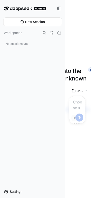
on phones the expanded drawer squeezes the main column to ~110px, composer
buttons overlap, and the settings dialog shrinks to a sliver. dsh-mobile
adds the missing phone tier (< 768px) as a client plugin — no shell fork, no
desktop changes.
Features
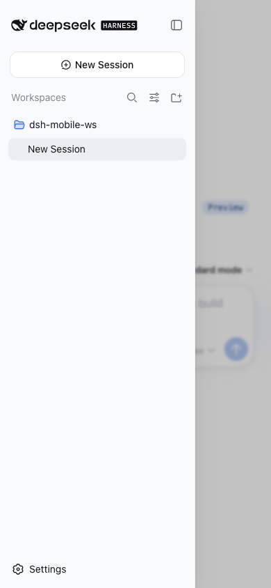
- Overlay sidebar drawer — opening the sidebar on a phone floats it over the content with a scrim instead of squeezing the main column to 110px; tapping outside closes it.
- Overlay details panel — the tool-details panel opens as a right-side overlay and never squeezes the conversation.
- Non-overlapping composer — the mode buttons and the model selector wrap onto separate rows instead of covering each other.
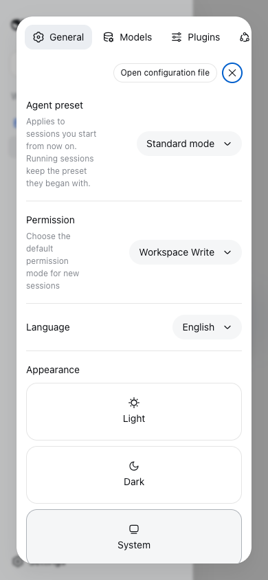
- Re-flowed settings dialog — the dialog stacks vertically with a horizontally scrollable tab bar; the content column gets full width.
- Zero desktop regression — every rule hangs under a narrow-viewport marker; viewports ≥ 1024px behave exactly like the stock shell.
Screenshots
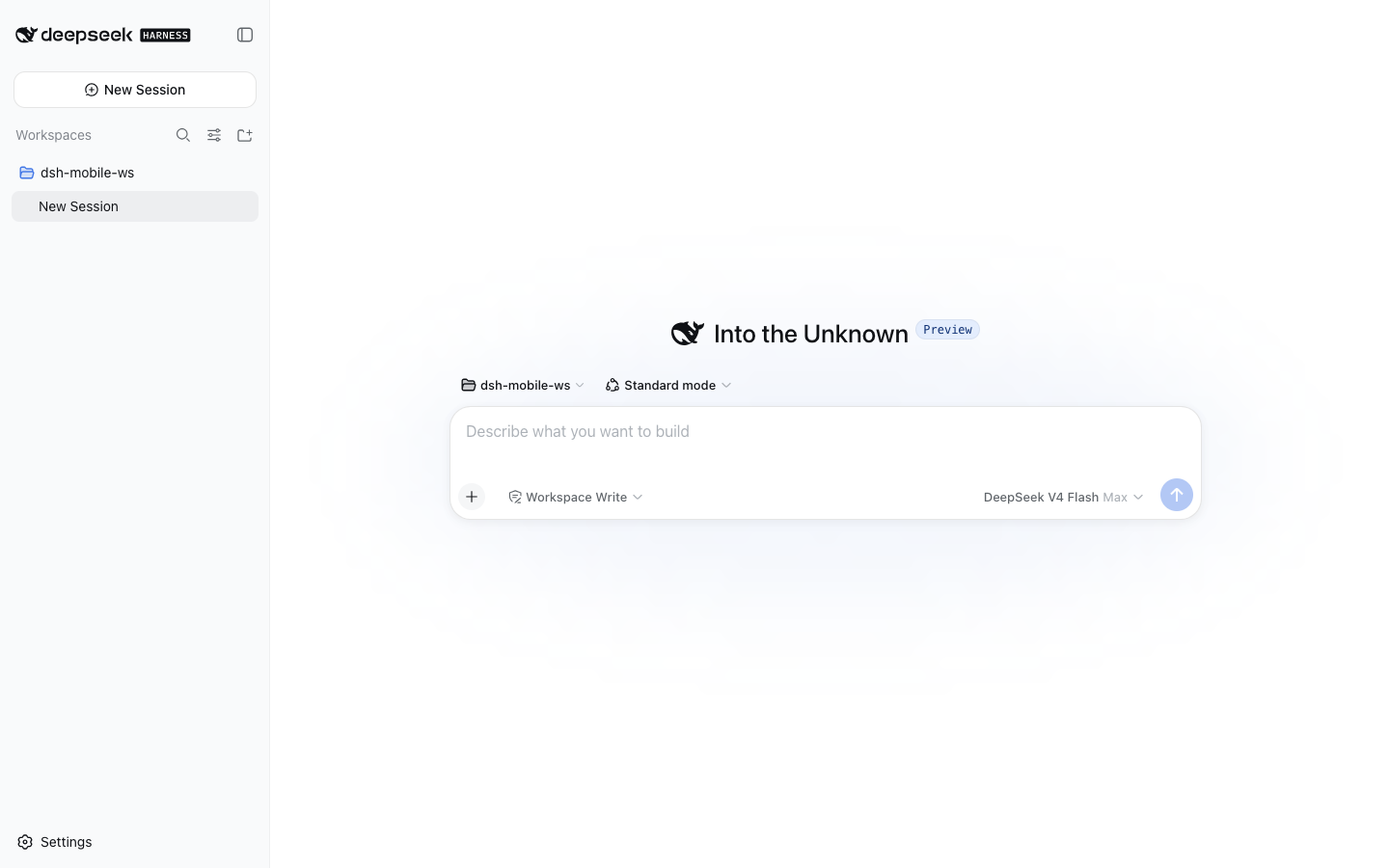
Verified on Ubuntu 24.04 (x86_64) with DSH 0.1.0-rc.6, iPhone-15 viewport
(390×844). Screenshots show the English UI.
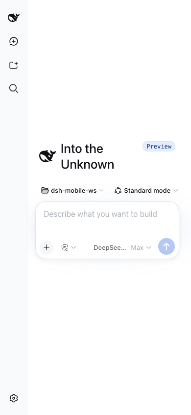
New-session screen on a phone (hero + composer with a workspace selected, laid out for the narrow viewport):
Sidebar drawer: before (stock shell) vs after
| Before — content squeezed to 110px | After — overlay drawer + scrim |
|---|---|
 |
 |
Settings dialog on a phone (vertical layout, full-width content):
Desktop ≥ 1024px — untouched:
Install
Requires Node ≥ 22 and a DSH installation (dsh CLI). Install into your
profile and restart dsh web:
dsh plugin --profile web add @tecfancy/dsh-mobile
# restart: dsh web
Note: if your npm registry is a mirror (e.g.
registry.npmmirror.com), brand-new packages can lag behind the official registry for a while — add--registry=https://registry.npmjs.org/if the install reports 404.
The plugin activates automatically on narrow viewports (< 768px) and stays
inert on desktop. Removing it is one command: dsh plugin --profile web remove @tecfancy/dsh-mobile.
How it works
- A JS breakpoint layer marks narrow viewports as
body[data-dsh-mobile]. - A state bridge mirrors the shell's layout state onto
body[data-dsh-drawer]/body[data-dsh-details]. - A stylesheet (anchored on the shell's stable
[data-slot]hooks) turns the sidebar/details columns into fixed overlays on phones, re-flows the composer and the settings dialog, and never runs outside the mobile tier.
No shell source is modified, no server component is required, and the plugin
coexists with other shell-level plugins (verified with dsh-better-sidebar).
Compatibility
- DSH
0.1.0-rc.6(tested on macOS and Ubuntu 24.04; full viewport matrix: 360 / 390 / 430 / 768 / 1440). - The 768–1023px tablet range keeps the stock shell behavior (by design).
prefers-reduced-motionis honored.
License
MIT
Links
More in this category
zhu1090093659/dsh-web#packages/dsh-task-board★ 8262
Task board for the dsh web GUI: a sidebar multi-column kanban whose cards run in real DSH agent sessions and can also be scheduled with cron expressions, executed host-side even with the browser closed.
zhu1090093659/dsh-web#packages/dsh-web-all★ 8262
Plugin and skin collection for the DSH Web UI: task board, Git graph, right-side panel, remote mobile UI, pet, live token stats, and a skin center.
omdsh-dev/DSH-better-sidebar★ 3943
Full sidebar workbench with file rendering and editing, terminal, Git, and subagents; third-party plugins can register new tabs.
ccch1mneyyy/dsh-TUI★ 3913
Claude Code-style full-screen terminal UI: pixel-whale header, live status line, and streaming thought expansion.
MeteorNOX/DeepSeek-Balance-Whale-Widget★ 3793
A fixed-corner whale widget for the DSH web GUI — balance, today's usage and per-turn cost with peak/off-peak pricing, editable balance-alert and daily-budget bubbles, a module-based custom bubble queue with A/B weighted choices and random lines or images, 30+ vendor templates (OpenAI, OpenRouter, Kimi, SiliconFlow, Ark, Zhipu, MiniMax and more) with per-model balance and subscription quota, plus task-end sound, imported audio, custom roles and a resource manager. Local-only, no telemetry.
Devin-AXIS/deepseek-design#deepseek-idesign★ 1414
Visual design studio for websites, app prototypes, posters, cards, reports, and magazines, with templates, direct element editing, selection-aware AI draft handoff, and export.
Community comments
Comments are public GitHub Discussions. Loading them connects to GitHub and Giscus; a GitHub account is required to post.