Mobile-viewport fixes for the dsh web GUI: overlay drawer sidebar with swipe gestures, icon-only composer with a mode · model · effort status line, centered popovers, and horizontal-overflow/scrollbar centering fixes.
Install
# from npm (prebuilt)
dsh plugin --profile web add dsh-mobile-webui
# from GitHub (first run asks for allowBuilds approval — follow the hint, retry)
dsh plugin --profile web add github:Odefined/dsh-mobile-webui
Any plugin you install runs third-party code with your own permissions — it can read your files, use your credentials, and reach the network, and tool approvals don’t sandbox it. GitHub-sourced plugins also run build scripts at install time — pnpm blocks those until you allow them, so an install can stop with ERR_PNPM_GIT_DEP_PREPARE_NOT_ALLOWED or ERR_PNPM_IGNORED_BUILDS; dsh prints the exact key to add under allowBuilds in your profile’s pnpm-workspace.yaml, and the install works on the next run. Allowing a build is a trust decision: only install sources you trust, and pin a commit (github:owner/repo#sha).
README
English | 中文
Fixes mobile-viewport usability problems in the dsh web GUI. Client plugin, pure browser-side, no build step.
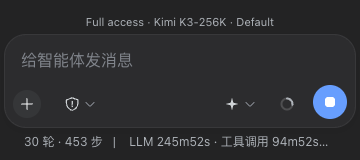
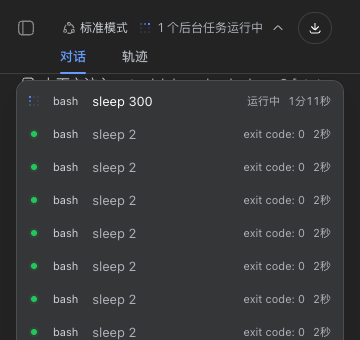
Demo (real 360px dark-mode screenshots)
| Icon-only composer + status line | Centered background-tasks popover |
|---|---|
 |
 |
What it fixes
Mobile-viewport fixes for the dsh web GUI as a client plugin: full-width chat with an overlay drawer sidebar, swipe gestures, safe-area/dvh composer, code-block horizontal scrolling, 44px touch targets, and an icon-only composer row with a small mode · model · effort status line above the card. Pure browser-side, no build step, zero effect on desktop widths.
Nine layout-layer rules additionally apply: ①≤768px hides fullscreen
background layers injected by other plugins (.dsh-viz-canvas /
.dsh-viz-scrim / .dsh-viz-root; no-ops when absent) and restores an opaque
page background — readability and battery come first on phones; ②≤768px
popover re-anchoring: composer popovers (model/effort picker, permission
modes) get position: static anchors so menus clamp inside the composer
card; header popovers (background-task list etc.) re-anchor to the
full-width session-header slot and center horizontally — the native small
anchor + left:0/right:0 pushes a 328px menu off-screen at ~360 CSS px
(measured: the tasks popover overflowed by 106px); ③≤768px the session-log
download button loses its text label and its min-width: 111px, shrinking
to a 34px icon; ④≤768px swipe gestures: a clearly-horizontal right swipe
opens the sidebar drawer, left swipe closes it (fires mid-gesture past a
64px threshold; vertical scrolling and horizontal scrolling inside code
blocks/tables are never hijacked; all listeners passive); ⑤≤768px icon-only
composer row: the model switcher hides its text and effort badge and gains
an injected neutral four-point-star icon (the native trigger is
text+badge+chevron only, so pure icon-ification must supply a recognizable
glyph; the permission-mode button already goes icon-only via an app rule),
while an 11px status line right above the input card shows
"permission · model · effort" live (read from the hidden labels, updates
instantly on switch; with labels hidden, the buttons' accessible names are
mirrored into aria-label) — ending the narrow-screen overlap of the two
triggers; ⑥≤768px the ask-question card footer may wrap and shrink
(flex-wrap + margin-left:auto) — Android text autosizing inflates the
skip/submit buttons, and the native flex-shrink:0 + space-between pushes
submit past the card's right edge (measured: 42px off-screen at 38px font;
after the fix it wraps fully visible); ⑦≤768px the conversation scroll
container drops scrollbar-gutter: stable — desktop reserves a permanent
8px strip on the right against scrollbar reflow, which left the composer
card at 4px left / 12px right margins (visibly off-center); phones use
overlay scrollbars that consume no layout, so dropping the gutter yields
symmetric 4px margins and +8px of message width (desktop keeps the stable
gutter); ⑧≤768px horizontal-overflow clamps: the message stats row
(time/token speed) stays single-line but may shrink and ellipsize (native
nowrap + min-width:auto pushed it 174px past a 360px viewport), tool-call
titles shrink and ellipsize, and the conversation container gets
overflow-x: hidden as a safety net — once content is wider than the
screen, the whole column (composer included) can drift sideways, which
reads as "never centered". For browsers with classic scrollbars (the
persistent, layout-consuming kind some Android browsers/WebViews ship), JS
measures the live scrollbar width into --dsh-mw-scrollbar-w and mirrors it
as left padding: the scrollbar stays, the content column centers; overlay
devices measure 0 and see zero behavioral change; ⑨≤768px settings-panel
full-screen rewrite: the native 312px floating dialog splits row-wise — the
tab nav alone takes 188px (60%), leaving a 124px content column where text
wraps one character per line (unusable). The rewrite makes the dialog
full-screen (100vw×100dvh, zero radius), switches to a column layout, turns
the tab nav into a horizontally scrollable single-row button strip on top
(36px, plus a fix for the stock label collapsing to zero width via
flex-basis:0), and gives the content full width. The hook
[role="dialog"][aria-modal="true"]:has(> nav) matches only the settings
panel — confirmations and pickers are untouched (idea adapted from
AcidGr/dsh-web-mobile-fix, MIT). Desktop is unaffected by
all of the above.
All class-name hooks are token-boundary anchored ([class$="_x"] /
[class*="_x "]) so they only match the component's own class tokens — bare
substring matching would hit inner children (e.g. _newSessionLabel).
Mobile z-order: drawer entry 16 < scrim 17 < sidebar drawer 18 < details drawer 19 < shell dialog layer 20 < menus/settings overlay 1000 — dialogs always sit above the drawer and stay tappable.
Deliberately out of scope (later versions): tool-call collapsing / bottom sheets, approval-interaction redesign, long-task notifications.
Compatibility
- Browser floor: Chrome/Edge ≥ 105, Safari ≥ 15.4, Firefox ≥ 121
(requires CSS
:has()anddvh;100dvhships with a100%fallback declaration). Older browsers simply ignore the rules and fall back to the native UI — the plugin only adds, never errors. - Host versions: selectors rely only on the host's semantic hooks
(
data-slot/data-phase/data-sidebar-collapsed/data-composer-seat/data-conversation-scroll) and CSS-Modules class suffixes (hash prefixes change, suffixes are stable). If a future host redesign removes the hooks, the plugin degrades to silent no-op — no effect, no errors, no broken page. - Display zoom: Android "display size / font size" scaling is covered by real-device testing (~360 CSS px effective width: drawer, popovers, header all verified).
- Coexistence with other plugins: the fullscreen-background hide rules
(
.dsh-viz-*) no-op when the corresponding plugin is absent; the drawer/scrim z-order stays below the shell dialog layer and never covers any dialog. - Desktop: every rule lives inside ≤768px or
(pointer: coarse)media queries — zero effect on wide screens and mouse pointers (regression verified).
Known host behavior: the sidebar inner root's width is an inline
style="width: 280px" written by the host's drag-resize feature; the mobile
drawer overrides it with width: 100% !important for symmetric padding.
How it works
The frontend uses hash-prefixed CSS Modules (e.g. pI_x6G_frame); the
plugin overrides them via stable selector hooks:
- Attribute hooks:
data-sidebar-collapsed/data-details-collapsed/data-slot/[data-composer-seat]/[data-phase]/[data-conversation-scroll] - Class suffixes + token-boundary anchoring:
[class*="_frame"]:has(> [class*="_sidebarCol"])etc. - Inline
grid-template-columnsand inline widths are overridden with!important
DOM intervention is limited to four injections: a scrim <div>, the drawer
entry <button>, the composer status-line <div>, and the model-trigger
icon <span> (all shown/hidden purely by CSS), plus a viewport-meta edit.
Everything takes effect only at ≤768px or on coarse pointers.
Install
Register the bundle and add the dependency in your local dsh web profile
(both edits in ~/.dsh/profiles/web/package.json):
{
  "dsh": { "profile": { "bundles": ["...", "dsh-mobile-webui"] } },
  "dependencies": {
    // npm (recommended):
    "dsh-mobile-webui": "^0.3.0"
    // or straight from GitHub:
    // "dsh-mobile-webui": "github:Odefined/dsh-mobile-webui"
  }
}
cd ~/.dsh/profiles/web
pnpm install
# restart dsh web (interrupts running sessions — save your work first)
dsh web
The plugin activates automatically after restart: cordis.patch.yml inserts
the package into the Loader, and the dsh.client declaration lets
client-modules put client.js into the web roster.
Verify
You can verify temporarily on a running page without installing (a refresh
reverts it). Note that __ModuleLoader__.load only registers the factory
without executing it — materialize manually:
// Playwright run-code (or the DevTools console equivalent)
await page.addScriptTag({ content: `
  window.__cap = null; const L = window.__ModuleLoader__; const orig = L.load;
  L.load = (s) => { window.__cap = s; }; window.__restore = () => { L.load = orig; };
` });
await page.addScriptTag({ path: '<this-repo-path>/client.js' });
await page.evaluate(() => {
  window.__restore();
  const mod = window.__cap.factory(() => { throw new Error('no require'); });
  mod.apply({ effect: (fn) => fn() });  // fake ctx: run effects immediately
});
Viewports 360×800 / 390×844 + touch emulation checkpoints: no persistent
rail, full-width chat column, original entry button top-left; tapping the
entry → opaque drawer + 48% scrim; scrim click / Escape / session pick /
left swipe → drawer closes; right swipe → drawer opens; horizontal scrolling
inside pre/table containers; icon buttons ≥44px under
(pointer: coarse); the composer row is icon-only without overlap, and the
status line right above the card shows "permission · model · effort";
drawer → Settings opens a full-screen settings panel with a scrollable tab
strip and full-width readable content; the
header Session-log button is a 34px icon; the viewport meta includes
viewport-fit=cover and interactive-widget=resizes-content.
At ≥769px none of the rules apply (sidebar inline-expanded, entry button
absent, composer text labels kept, background layers intact).
Uninstall
Remove both the bundles and dependencies entries from
~/.dsh/profiles/web/package.json, run pnpm install, and restart
dsh web.
License
MIT
Links
More in this category
zhu1090093659/dsh-web#packages/dsh-task-board★ 8334
Task board for the dsh web GUI: a sidebar multi-column kanban whose cards run in real DSH agent sessions and can also be scheduled with cron expressions, executed host-side even with the browser closed.
zhu1090093659/dsh-web#packages/dsh-web-all★ 8334
Plugin and skin collection for the DSH Web UI: task board, Git graph, right-side panel, remote mobile UI, pet, live token stats, and a skin center.
ccch1mneyyy/dsh-TUI★ 3989
Claude Code-style full-screen terminal UI: pixel-whale header, live status line, and streaming thought expansion.
omdsh-dev/DSH-better-sidebar★ 3981
Full sidebar workbench with file rendering and editing, terminal, Git, and subagents; third-party plugins can register new tabs.
MeteorNOX/DeepSeek-Balance-Whale-Widget★ 3944
A fixed-corner whale widget for the DSH web GUI — balance, today's usage and per-turn cost with peak/off-peak pricing, editable balance-alert and daily-budget bubbles, a module-based custom bubble queue with A/B weighted choices and random lines or images, 30+ vendor templates (OpenAI, OpenRouter, Kimi, SiliconFlow, Ark, Zhipu, MiniMax and more) with per-model balance and subscription quota, plus task-end sound, imported audio, custom roles and a resource manager. Local-only, no telemetry.
Devin-AXIS/deepseek-design#deepseek-idesign★ 1412
Visual design studio for websites, app prototypes, posters, cards, reports, and magazines, with templates, direct element editing, selection-aware AI draft handoff, and export.
Community comments
Comments are public GitHub Discussions. Loading them connects to GitHub and Giscus; a GitHub account is required to post.